


DARKO FARMS
Version 1.0 · 2026Logo & Identity
The mark, its type, its colors, and how it applies to print and apparel.
The Logo
The Darko Farms identity has two lockups: the horizontal wordmark for everyday use, and the circular emblem for seals, stamps, and compact applications.
Clearspace
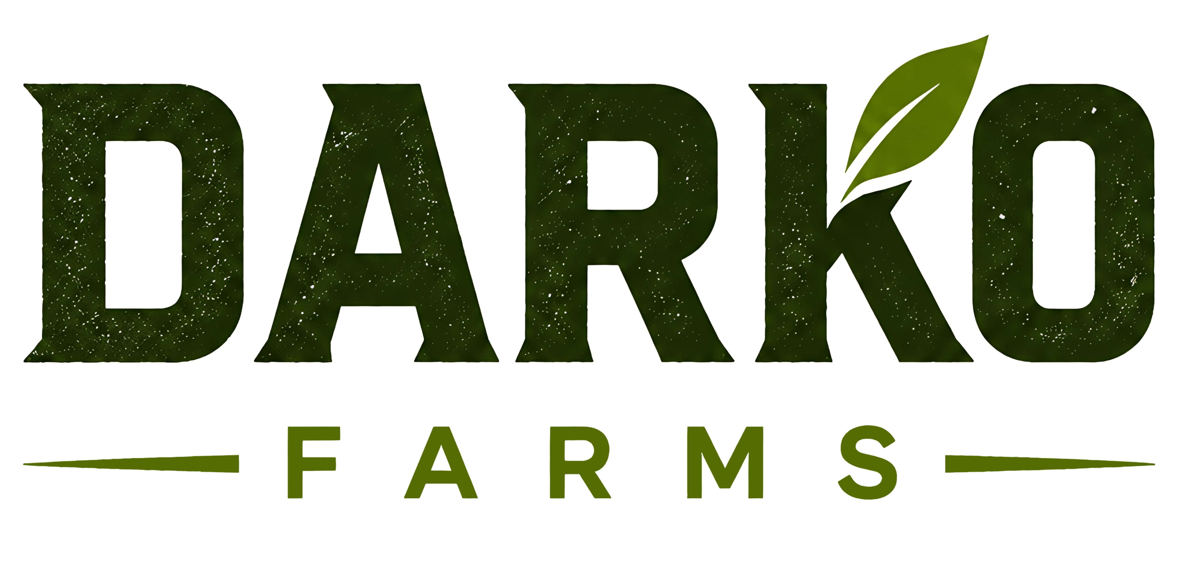
Keep the area around the logo free of other elements. Use the height of the leaf as the minimum clearspace on all sides.
Do Not
- ✗ Do not stretch or distort the logo.
- ✗ Do not recolor or add effects.
- ✗ Do not rotate the lockup.
- ✗ Do not place on busy backgrounds.
- ✗ Do not separate the emblem from the wordmark incorrectly.
Logo Typography
The logo pairs two typefaces: Correo for the DARKO wordmark, and Montserrat for the FARMS subheading.
DARKO
Correo — Regular (400), used for the DARKO wordmark.
FARMS
Montserrat — SemiBold (600), wide letter-spacing for a clean, modern balance.
Logo Colors
The logo's palette is earthy and grounded: forest greens for the wordmark and a parchment cream for the emblem.
Applications
The identity applied across stationery, apparel, and packaging. Keep logo, color, and placement consistent.
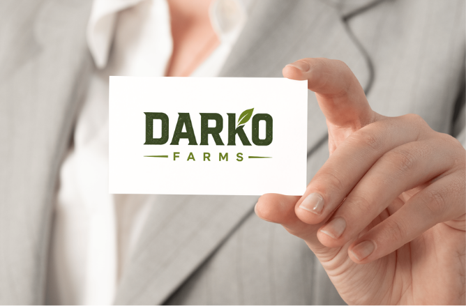 Business Card
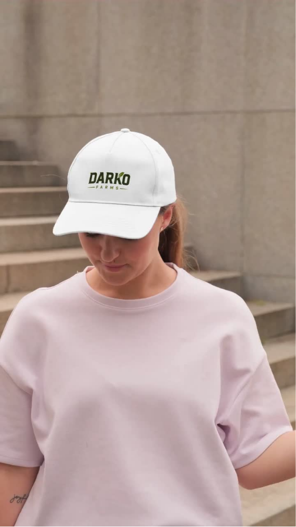 Cap
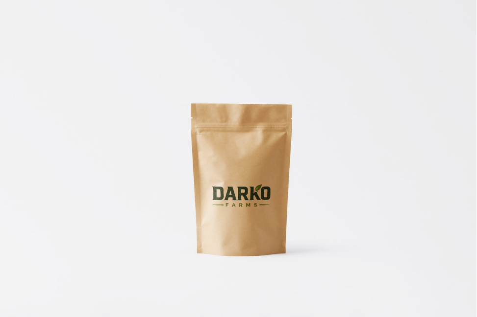 Kraft Pouch
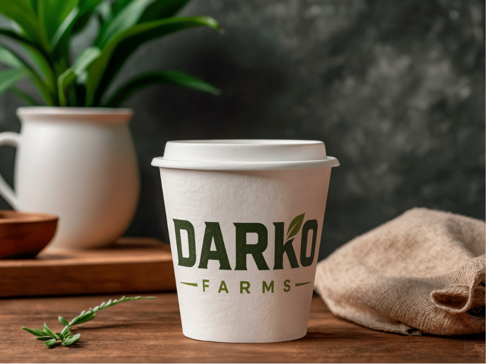 Coffee Cup
Website Standards
The digital palette, type system, and components that carry the brand online.
Website Colors
The website palette extends the brand for screen: a deep field green, harvest orange, and soft crop greens for surfaces and accents.
Website Typography
At Aero carries the voice in headlines; General Sans keeps the body calm; Figtree handles navigation and labels.
At Aero
Headlines.
General Sans
Body & captions.
Figtree
Navigation & labels.
Website Applications
How the website identity comes together: header navigation, buttons, hero surfaces, and the app icon.
Buttons
App Icon
Use the emblem on favicons, app icons, and social avatars where the full wordmark won't fit.